Streamlining Poster House Website's Mobile Experience to Drive Museum Visits
Year / 2023
Client / Poster House Museum, New York City
Team Members / Anne K., Cici L., Esha M., Yang C.
My Role / Usability Testing, Behavior Analysis, Ux Strategy, UI Design
The user experience of a museum's website plays a pivotal role in shaping visitors' overall engagement, facilitating efficient visit planning, and fostering connection with the museum's community and initiatives.
This case study focuses on Poster House, a museum that inspires a diverse audience in New York City, including creators, designers, artists, typography enthusiasts, cultural enthusiasts, and tourists, to explore visual art and culture. Collaborating with the Poster House team, our objective was to enhance key touchpoints on their website, driving audience engagement and ultimately boosting conversion rates. Recognizing the significance of mobile users, comprising 62% of their audience, we conducted eye-tracking studies and utilized web analytics to evaluate the mobile web experience. Our findings revealed four key areas for potential improvement.
This project concludes with design solutions, delving into UX best practices for museum website design, including exhibition promotion, key word search and newsletter subscription features.
Understanding Poster House's audience, core offering and goals
Poster House is dedicated to highlighting posters' cultural impact and artistic value, presenting them as both historical relics and modern tools for visual expression. As the first poster museum in the United States, it acts as a center for discovery and education for design enthusiasts, advertising aficionados, and those interested in public engagement, aiming to elevate design awareness among the general public. The museum also appeals to a growing younger audience while continuing to cater to the interests of creators, designers, artists, typography enthusiasts, museum enthusiasts, cultural enthusiasts, and tourists.
Designing a Usability Test plan to evaluate mobile web experience
We conducted 9 eye-tracking sessions and analyzed user data using web analytics tools like Google Analytics and Hotjar as a part of our methodology for the usability studies.
Eye-tracking Studies:
We conducted eye-tracking studies to understand where individuals focus and how their gaze shifts on a webpage which provided us vital insights for improving user experience and design thereby understanding users' interactions with websites' interfaces.
Recruiting Participants :
Total No. of Participants : 9 participants
Age Group : 23 - 35 years
Interests : Exploring art, museums and exhibitions, Watching movies, and reading books
Device/s : Mobile phone
Tasks :
-
Discovering and browsing through the exhibition pages
-
Explore the homepage
-
Searching for information/content on the website
-
Subscribing to the Poster House newsletter
We adopted a 'Retrospective Think Aloud (RTA)' method for interviewing users by including pre/post-task questions during the eye-tracking sessions which helped us gather more qualitative insights on users' needs and motivations.
With users' consent, we recorded and transcribed each eye-tracking session to analyze the pain/gain points in the user journeys, in aligment with the data from web analytics. The results were analyzed using 'heatmapping,' 'gaze plotting,' and 'scroll mapping' techniques to evaluate user behavior when interacting with the Poster House website on mobile devices.
*You can find the moderation script for the eye-tracking test along with the task list here.
Web Analytics
We utilized Google Analytics and Hotjar for detailed insights on user groups, user journeys of large sample sizes (user visits over a period of 30 days) to guide and complement our findings from the Eye - tracking studies.
This helped us assess demographic/ device information for recruiting participants, determining areas of insight for usability testing and setting parameters to propose design changes.

Fig 1. The Google Analytics dashboard for the Poster House website

Fig 2. The Hotjar dashboard for the Poster House website
Fig. 3. Example of Gaze-plotting using the Tobii eye-tracking software:
The circles denote areas on the webpage where users focus their attention, and the lines track their eye movements.
Fig 4. Example of Heatmapping using the Tobii eye-tracking software:
Red indicates areas of highest user focus, green indicates areas of lowest focus, and yellow indicates intermediate areas of focus.

Fig 5. Example of Scrollmapping using Hotjar web analytics:
Scrollmaps illustrate users' scrolling behavior on the webpage. Red denotes sections of highest traffic, yellow signifies intermediate traffic, and green indicates areas with the lowest traffic.
An overview of the project timeline
September, 2023
Kick-off Meeting with the Poster House Team
Mid October, 2023
December, 2023
Final Presentation
and Handover
Mid-Point
Check-in
Research Planning
Gathering insights from Web Analytics
Recruiting participants and preparing moderation scripts
Conducting eye-tracking sessions
Drafting A/B Test Plan
Data Collection & Analysis
Prototyping design solutions
Report-making
FINDINGS &
RECOMMENDATIONS
Overall, how did the website offer a good mobile experience?
1. Users valued the website's clean and stimulating design, recognizing its visual consistency across all pages.
"I really like the aesthetic of this website, it’s (the primary colors) monochrome, but minimalist make it look great!"
2. The "First Friday" banner on the homepage immediately intrigued users with its popping-blue background and the "free entry" mention.
"First Friday caught my eye - especially, the free admission part."
3. The footer served as a reliable navigation element in mobile experience.

Fig 6.
Gaze-plots of users eye movements on the footer
The eye-tracking study and web analytics findings enabled us to discover several pain-points in the navigation flows that users might experience when browsing through the paid social medial advertisements and exhibition pages, as well as searching for content on the website and discovering labels to the complete navigation experience. After analyzing user journeys for each task, we were able to synthesize these pain-points into 4 key areas of insight. They are outlined below:
1. Discovering Poster House advertisements on social media platforms
2. Scanning information on the exhibition pages
3. Searching for information and accessing search results
4. Effectivity of labels in aiding the navigation flow
1. Discovering Poster House advertisements on social media platforms
In our kickoff meeting with the client, we delved into the importance of assessing the impact of social media ads on directing traffic to the Poster House website, especially with their recent paid campaigns.
Given that 62% of Poster House's user base are mobile users, we saw an opportunity to focus on the 'social media to website' navigation experience for usability testing, aiming to gain insights into website discoverability and user engagement.
To validate our hypothesis, we tested two social media campaigns (as proposed by the Poster House team) :
For testing, users were asked to imagine browsing through Instagram stories and clicking on an ad they liked. We created Mock-ups of the Instagram app's "story browsing experience" to observe which ad users clicked on and why.
We found that -

Fig 1.1 Poster House Instagram ad


2/9
participants
Chose 'Art Deco: Commercializing
the Avant-Garde'
> Users preferred the vertical transitions to horizontal in the animation format of the stories because they intuitively align with their browsing habits on Instagram Stories.
> The motion of the advertisements was distracting for some users as they indicated that it was too fast for them to read through the content.
> Users were more inclined to click on ads that align with their personal interests, fields of study, or if they find the content visually appealing.
2. Scanning information on exhibition pages

Least Gazes
Selected Images
Related Events
Press/ Reviews
Most Gazes
Exhibition Title
Cover Image
Footer
Bullet Points
Quotes
Introduction Paragraph

Most Gazes
Exhibition Title
Footer
Introduction Paragraph
Bullet Points
Cover Image
Least Gazes
Selected Images
Related Events
Press/ Reviews
UX Problem #1
Users struggled with scanning through information on exhibition pages because they have too much text and require a lot of scrolling.
> They needed better categories and pointers to find and sort information.
> When comparing scroll maps for desktop and mobile views of exhibition pages, we noticed that 88% of desktop users viewed the exhibition details information block, while only 69% of mobile users did. This indicated that mobile users had to scroll more, leading to a higher bounce rate.
Desktop 88%
Mobile 69%

Fig. 2.3 In the scrollmaps above, created using Hotjar, it's evident that 87% of desktop users scrolled to access the exhibition details, whereas only 69% of mobile users reached that section.
UXD Solution #1
Prioritizing scannable information to the top and shortening the scroll depth by introducing tabs or accordions would make it easier for users to understand the exhibition.
> To enhance content categorization, we recommended introducing 'tabs' to group information.
> This would enable users to quickly navigate through different information blocks at a glance, optimizing the scrolling experience.
> Similarly, images could be organized into carousel formats to further optimize the scroll depth.
Fig 2.4 Proposed interface mock-up to address text-heavy content and excessive scrolling on exhibition pages
UX Problem #2
The exhibition pages sparked users' curiousity, but they were not effective in aiding users with essential visit planning information to satisfy their curiosity.
> This may directly impact conversions. Given their significance as key landing pages for social media campaigns, users expected direct access to exhibition-specific visit information.
> On mobile, the "Visit" main-menu category was not consistently present (Refer fig 2.5). The user interviews highlighted specific needs, including separate ticket prices, images of the space, exact location and directions, visiting hours, and food/beverage restrictions.
"Location is my priority, but there is no additional information"
"I can only see one poster from the exhibition on this page. What is the exhibition space like?I would like to know that."

Fig 2.5 Screenshot of the visiting information available on the exhibition pages
UXD Solution #2
Adding a "Visit" button that directs users to a dedicated page containing all the crucial visit planning information highlighted by users.
> The mock-up (Fig 2.6) demonstrates an effective improvement in users' ability to navigate exhibition details and access all the information needed for attending a Poster House exhibition of their interest
> Having this information readily available, users are likely to efficiently plan their visit to Poster House, ensuring a higher overall conversion rate.
> Including additional images and videos showcasing the exhibition space, such as launch parties or other events, could further capture users' interest

Fig 2.6 Proposed placement for introducing exhibition-specific visit planning information
3. Searching for information and sorting search results
UX Problem #3
Users couldn't directly locate the search feature on the homepage unless they opened the hamburger menu.
> Unlike the Desktop view, the keyword search feature was not visible on all pages of the website. Instead, it could be accessed by clicking the hamburger icon, which expands to the main menu categories.
> Users suggested that this additional step could be avoided for easier navigation. Our findings also highlighted that the main menu, footer, and search features are the most crucial accessibility elements of the website. Therefore, addressing gaps in their user experience became a top priority.

Fig. 3.1 The above image illustrates the navigation flow for accessing the search feauture
UXD Solution #3
Surfacing the search feature across all pages for easy access.
> Taking users' direct feedback into account, we recommended two placements for improving the visibility of the search feature:
1. Alongside the Hamburger icon of the main navigation menu using a 'search' icon.
2. A floating search icon across all pages which can be moved around similar to the iPhone "Home" button.


Fig. 3.2 Mock-ups of design options presented to resolve the issue of the accessing search feature
UXD Problem #4
Users faced difficulty sorting search results according to their specific requirements, such as upcoming or past events.
> While browsing the search results page, users were primarily drawn to the title, subtitle, and the number of results, as indicated by the heatmap in Fig 3.3.
> Our research highlighted the necessity for improved methods to sort search results based on date and time, enabling users to differentiate between past and upcoming events.
"I would want a search and filter option, I had do scroll through a bunch of different exhibitions"
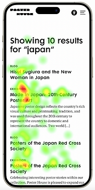
Fig 3.3 Heatmap depicting user interactions with the search results page while conducting a task to find exhibitions related to Japan.
UXD Solution #4
Incorporating filtering options to help users organize the search results by their preference.
> The filtering menu can incorporate options to organize the search results by date, recent, past, and upcoming events.
> Additional considerations included options for location, artist, and so on.

Fig 3.4 Proposed UI design to incorporate filtering options on the search results page
4. Effectivity of labels in aiding navigation flows
UX Problem #5
On the mobile view of the Poster House website, users encountered challenges in subscribing to newsletters.
> Users struggled to find the newsletter feature while navigating through the navigation menu - they navigated to the “join” sub-menu (refer fig 4.1)
> The website utilized the label "Subscribe to Mailing List," a term less familiar to users compared to other platforms they have interacted with for newsletter subscriptions.
Fig 4.1 Insights from gaze plotting during the eye-tracking session reveal users encountering challenges in locating the Newsletter feature within the navigation menu.
UXD Solution #5
Introducing the Newsletter feature in the 'Join' section of the navigation, labeled as "Join our Newsletter."
> As part of the design solutions, we proposed two placements for the newsletter feature on the Poster House mobile website, aiming to enhance conversions for newsletter sign-ups:
1. In the "Join" section in the navigation
2. A 'Marquee" call-out on the homepage
> We also proposed changing the label "Join our mailing list" to "Join our Newsletter" to align with users general habits of engaging with newsletters.

Fig 4.2 Mock-ups of design solutions that propose two different placements to be included on the mobile website for introducing the newsletter feature
*To assess the effectiveness of the two recommended placements in boosting newsletter subscriptions, we also provided the Poster House team with an A/B Testing Plan
UX Problem #6
Issues with the information block on the homepage going by “Museum, Shop, Cafe"
> The placement and visual hierarchy of the “Museum, Shop, Cafe” block on the homepage confuses users about Poster House's core offerings.
"I am confused about the first section - cafe stood out, but I am confused if it’s commercial space or just a museum"
> Additionally, we noted that the labels "Museum," "Shop," and "Cafe" not being clickable hinder users' understanding, preventing them from gaining more information about the offerings.
“These look like buttons but I cannot click on them”

Fig 4.3 The visual hierarchy in the information block attributes equal emphasis on 'Museum', 'Shop' and 'Cafe'
UXD Solution #6
Reiterating the visual hierarchy of the “Museum, Shop, Cafe" information block and making the labels clickable
> The Fig. 4.4 shows proposed the visual hierarchy for introducing the labels 'Museum', 'Shop' and 'Cafe' to clarify the core offerings of Poster House with an emphasis on museums and exhibitions.
> Additionally, enabling these labels to be clickable would encourage users to seek more information about each offering, prompting them to explore the website further. We proposed the following navigation flows for the clickable labels
Museum > Poster House "About" webpage
Shop > Poster House "Shop" website
Cafe > Poster House "Cafe" webpage

Fig 4.4 Proposed visual hierarchy of the Information block with clickable labeling
In conclusion,
This usability study not only established crucial best practices for designing museum websites but also uncovered specific mobile-related challenges that impact users' interactions with Poster House's offerings. While the website already provides a visually appealing and user-friendly experience, our proposed solutions aim to further elevate user engagement, potentially driving conversions and encouraging on-site visits. The positive reception and appreciation from the Poster House team indicate a fruitful collaboration, opening avenues for future improvements and innovations.
Moving forward, implementing A/B tests, enhancing visual content, and ensuring consistency between mobile and desktop experiences are promising steps. Reflecting on the process, incorporating quantitative measures like a System Usability Scale (SUS) in interview questionnaires would be a valuable addition for a more comprehensive assessment.
Overall, this study not only addresses current challenges but sets the stage for Poster House to continue evolving and providing an exceptional user experience.
Everything was structured in a super logical way. Looking at the past few months, each meeting and each check-in was a very straightforward progression from the previous session. I really appreciate your attention to detail. Your design skills are exceptional.
The presentation, the structure, and also the list of appendix so that we can actually look at your process and take from it, are extremely helpful.
You have been very professional. You have communicated very clearly - you've stayed on top of this. So, this has been an amazing project. Thank you so much, I am very very impressed with you guys.